With answers (default): quarto render viz-handout.qmd
Without answers (figures only): quarto render viz-handout.qmd -P show_answers:false
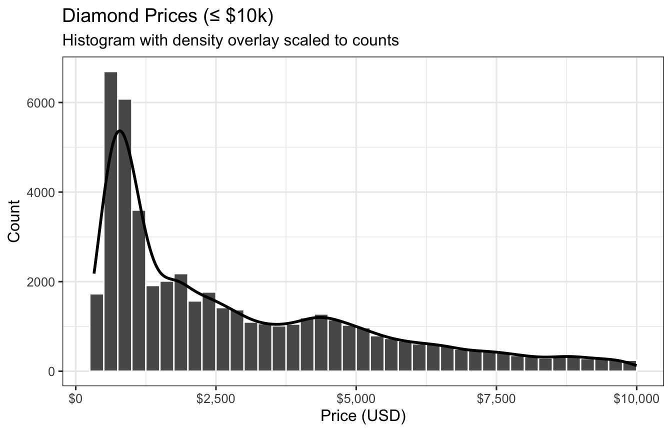
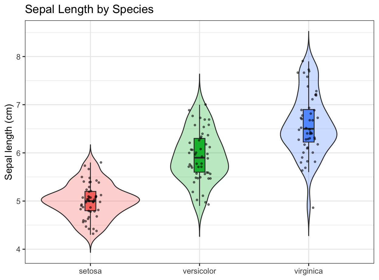
1) Distribution: Histogram + Density Overlay (Diamonds)
You are given ggplot2::diamonds (>50k rows). Create a histogram of price (restrict to $10,000 or less for visibility), overlay a scaled density curve so both share a comparable y-scale, and style axes and labels.
Requirements
Filter to price <= 10000.
Histogram with a binwidth of 250.
Overlay a density where y = after_stat(count) * 250 so peaks align with histogram counts.
Label axes and apply a dollar formatter to x-axis.
Use theme_bw() and a concise title/subtitle.
Show answer code
library(ggplot2)p1 <- diamonds |>filter(price <=10000) |>ggplot(aes(price)) +geom_histogram(binwidth =250, boundary =0, closed ="left", color ="white") +geom_density(aes(y =after_stat(count) *250), linewidth =1, alpha =0.15, fill =NA) +scale_x_continuous(labels = scales::dollar_format(accuracy =1)) +labs(title ="Diamond Prices (≤ $10k)",subtitle ="Histogram with density overlay scaled to counts",x ="Price (USD)", y ="Count" ) +theme(legend.position ="none")p1
Figure 1: Histogram and scaled density of diamond prices (≤ $10k).
1.1) Make the above graph better
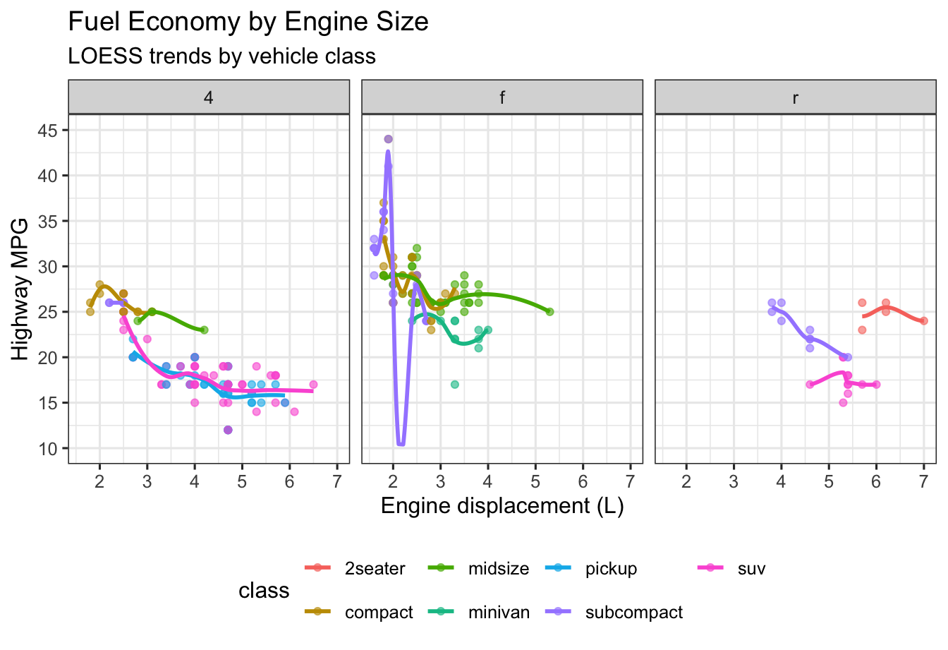
2) Bivariate: Scatter with LOESS Trend + Facets (MPG)
Using ggplot2::mpg, visualize highway mileage (hwy) vs engine displacement (displ), colored by class. Add a LOESS smooth and facet by drive (drv).
Requirements
geom_point(alpha = 0.6) and geom_smooth(se = FALSE, method = "loess").
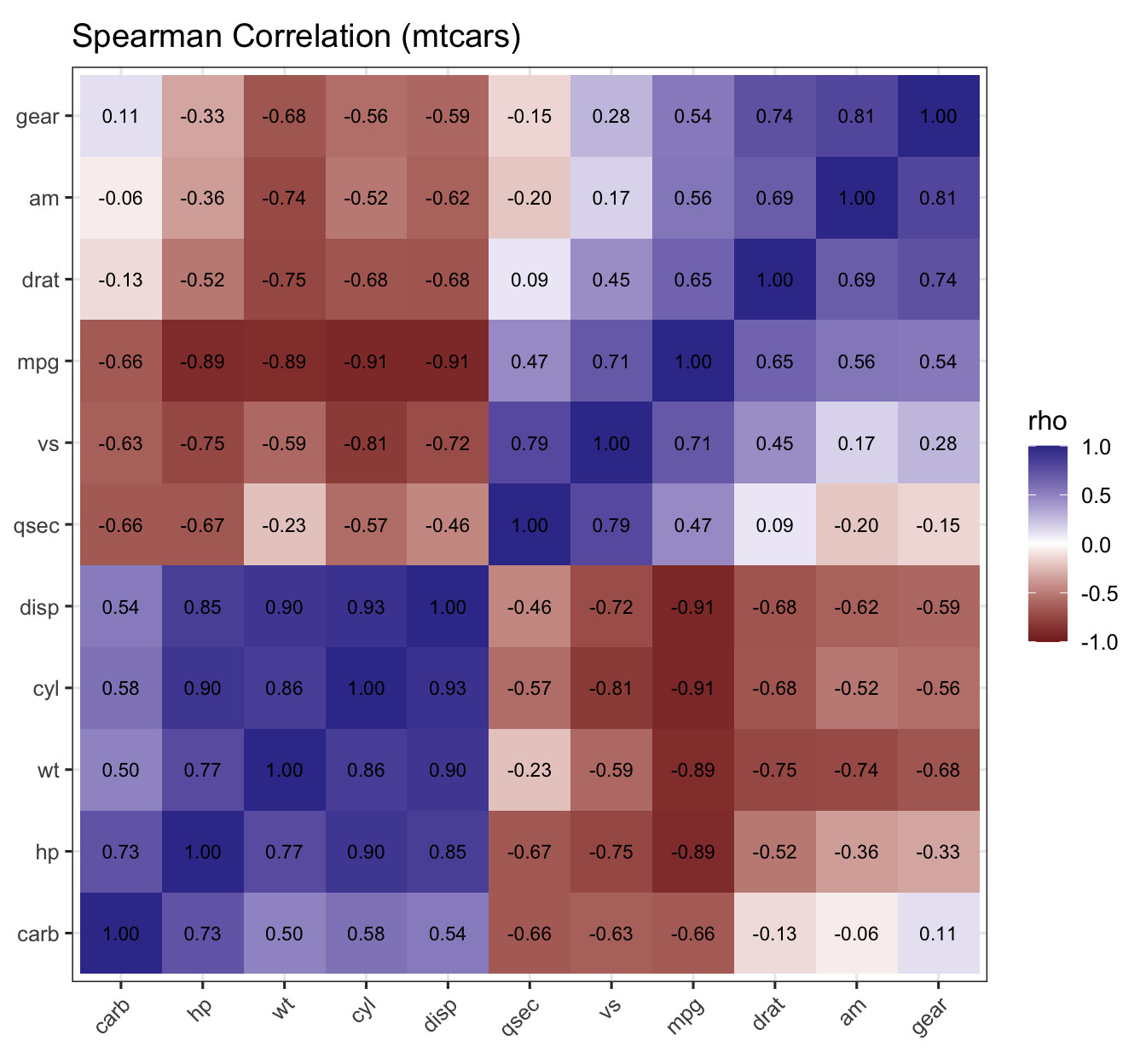
Figure 6: Spearman correlation heatmap with hierarchical clustering (mtcars).
6.1) Make the above graph better
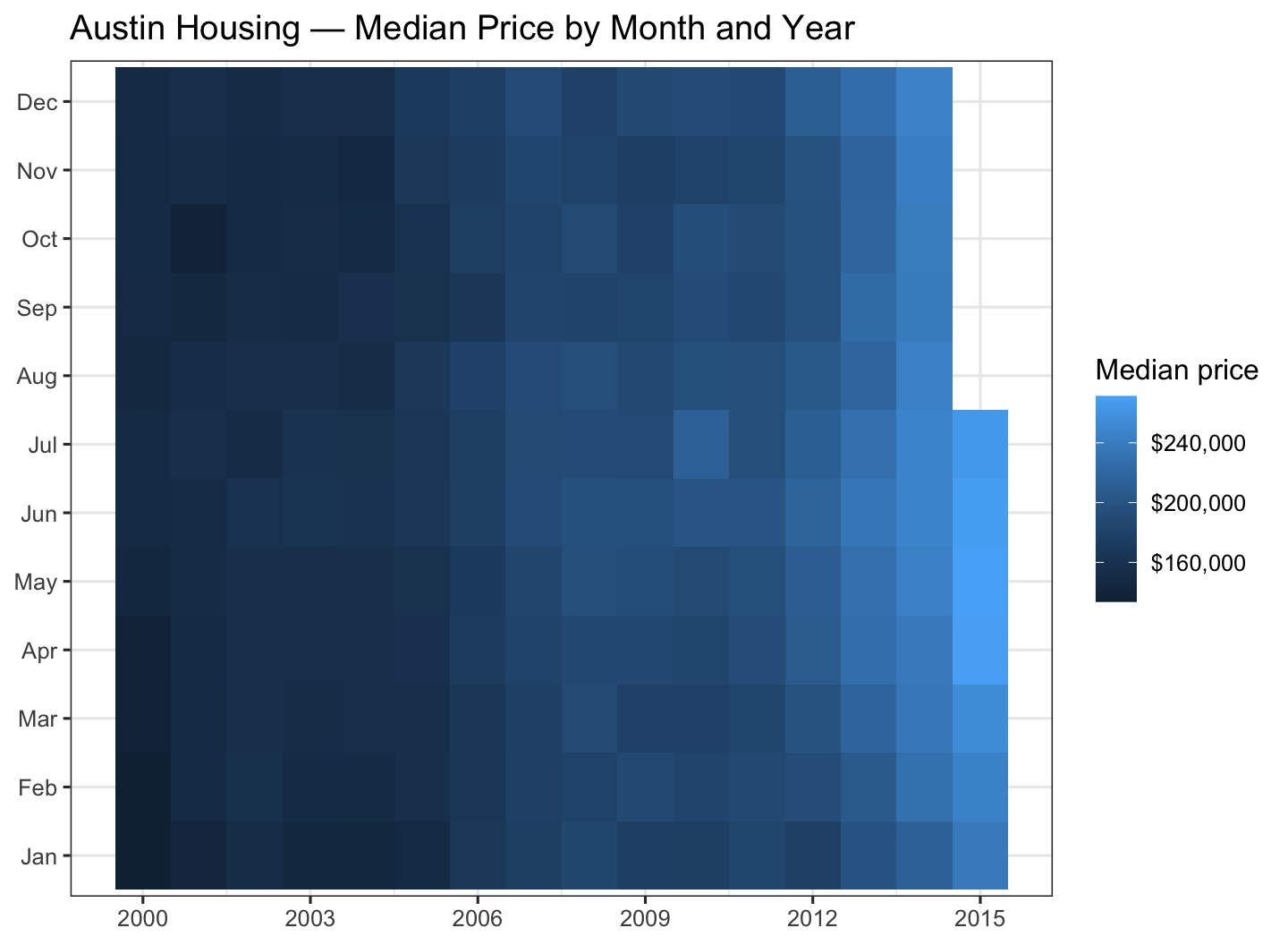
7) Tile Heatmap: Housing Prices by Month × Year (txhousing)
Using ggplot2::txhousing, create a month × year heatmap of median home prices for Austin.
Requirements
Filter city to "Austin".
Limit years to 2000–2015.
Y-axis should be month (Jan–Dec).
Fill tiles by median (median sales price).
Add a readable color scale and labels.
Show answer code
# subset and prepare month labelsau <- txhousing |>filter(city =="Austin", year >=2000, year <=2015) |>mutate(Month =factor(month, levels =1:12, labels = month.abb))ggplot(au, aes(year, Month, fill = median)) +geom_tile() +scale_fill_gradient(labels = scales::dollar, name ="Median price") +scale_x_continuous(breaks =seq(2000, 2015, by =3)) +labs(title ="Austin Housing — Median Price by Month and Year",x =NULL, y =NULL ) +theme(legend.position ="right")
Figure 7: Median home price (Austin): month × year heatmap (txhousing).
7.1) Make the above graph better
Appendix: Session Info (hidden)
Source Code
---title: "Data Visualization"subtitle: "How to Make Dynamic Figures"author: "08-Data Visualization"format: html: toc: true toc-depth: 2 code-fold: true code-tools: true code-summary: "Show answer" df-print: pagedparams: show_answers: true # Set to false to hide all answer code but still render figuresexecute: freeze: auto echo: true warning: false message: false---::: callout-tip## How to render with/without answers- **With answers (default)**: `quarto render viz-handout.qmd`- **Without answers** (figures only): `quarto render viz-handout.qmd -P show_answers:false`:::```{r}#| label: setup#| include: false#| echo: false# Load packages and set a default themesuppressPackageStartupMessages({library(tidyverse)})set.seed(123)theme_set(theme_bw(base_size =12))```# 1) Distribution: Histogram + Density Overlay (Diamonds)You are given `ggplot2::diamonds` (>50k rows). Create a histogram of **price** (restrict to \$10,000 or less for visibility), overlay a scaled density curve so both share a comparable y-scale, and style axes and labels.**Requirements**- Filter to `price <= 10000`.- Histogram with a **binwidth of 250**.- Overlay a **density** where `y = after_stat(count) * 250` so peaks align with histogram counts.- Label axes and apply a dollar formatter to x-axis.- Use `theme_bw()` and a concise title/subtitle.```{r}#| label: fig-diamonds-price#| fig-cap: "Histogram and scaled density of diamond prices (≤ $10k)."#| echo: !expr params$show_answers#| code-summary: "Show answer code"#| fig-width: 7#| fig-height: 4.5library(ggplot2)p1 <- diamonds |>filter(price <=10000) |>ggplot(aes(price)) +geom_histogram(binwidth =250, boundary =0, closed ="left", color ="white") +geom_density(aes(y =after_stat(count) *250), linewidth =1, alpha =0.15, fill =NA) +scale_x_continuous(labels = scales::dollar_format(accuracy =1)) +labs(title ="Diamond Prices (≤ $10k)",subtitle ="Histogram with density overlay scaled to counts",x ="Price (USD)", y ="Count" ) +theme(legend.position ="none")p1```---# 1.1) Make the above graph better --- # 2) Bivariate: Scatter with LOESS Trend + Facets (MPG)Using `ggplot2::mpg`, visualize **highway mileage (hwy)** vs **engine displacement (displ)**, colored by **class**. Add a LOESS smooth and facet by **drive (drv)**.**Requirements**- `geom_point(alpha = 0.6)` and `geom_smooth(se = FALSE, method = "loess")`.- Axis limits: `y` from 10 to 45.- Facet by `drv` with `facet_wrap(~ drv, nrow = 1)`.- Place legend at the bottom.```{r}#| label: fig-mpg-scatter#| fig-cap: "Highway MPG vs. engine displacement, colored by class, faceted by drive (mpg)."#| echo: !expr params$show_answers#| code-summary: "Show answer code"#| fig-width: 7#| fig-height: 4.8mpg |>ggplot(aes(displ, hwy, color = class)) +geom_point(alpha =0.6) +geom_smooth(se =FALSE, method ="loess") +scale_y_continuous(limits =c(10, 45), breaks =seq(10, 45, 5)) +labs(title ="Fuel Economy by Engine Size",subtitle ="LOESS trends by vehicle class",x ="Engine displacement (L)", y ="Highway MPG" ) +facet_wrap(~ drv, nrow =1) +theme(legend.position ="bottom")```---# 2.1) Make the above graph better --- # 3) Small Multiples: Facet Wrap by Class (MPG)Produce small multiples of **hwy vs displ** but facet by **class** to compare patterns across vehicle classes.**Requirements**- Same base mapping as above; facet by `class` (`ncol = 4`).- Use a consistent y-scale.- Add a translucent linear fit per panel (`method = "lm"`).```{r}#| label: fig-mpg-facets#| fig-cap: "Small multiples of hwy vs displ by vehicle class (linear fits)."#| echo: !expr params$show_answers#| code-summary: "Show answer code"#| fig-width: 8#| fig-height: 7mpg |>ggplot(aes(displ, hwy)) +geom_point(alpha =0.6, color ="grey30") +geom_smooth(method ="lm", se =FALSE, linewidth =0.8, alpha =0.9) +scale_y_continuous(limits =c(10, 45), breaks =seq(10, 45, 5)) +labs(title ="Fuel Economy vs Engine Size by Vehicle Class",x ="Engine displacement (L)", y ="Highway MPG" ) +facet_wrap(~ class, ncol =4)```---# 3.1) Make the above graph better --- # 4) Time Series: Unemployment Rate with 12-Month Moving Average (economics)Using `ggplot2::economics`, compute the **unemployment rate** as `100 * unemploy / pop`. Plot the monthly rate and a 12-month moving average.**Requirements**- Create `urate = 100 * unemploy / pop`.- Compute a 12-month moving average using `stats::filter`.- Plot `urate` as a faint line and overlay the moving average as a thicker line.- Limit the x-axis to 1970–2010 for focus.```{r}#| label: fig-economics-ma#| fig-cap: "US unemployment rate with 12-month moving average (1970–2010)."#| echo: !expr params$show_answers#| code-summary: "Show answer code"#| fig-width: 7#| fig-height: 4.5library(stats)economics |>mutate(urate =100* unemploy / pop,ma12 =as.numeric(stats::filter(urate, rep(1/12, 12), sides =1)) ) |>filter(date >=as.Date("1970-01-01"), date <=as.Date("2010-12-31")) |>ggplot(aes(date, urate)) +geom_line(alpha =0.4) +geom_line(aes(y = ma12), linewidth =1) +labs(title ="US Unemployment Rate",subtitle ="Monthly values with 12-month moving average",x =NULL, y ="Percent" )```---# 5) Distribution by Group: Violin + Box + Jitter (iris)Using `datasets::iris`, compare **Sepal.Length** by **Species** with violins, embedded boxplots, and jittered points. Reorder species by median sepal length.**Requirements**- Reorder x-axis by median `Sepal.Length`.- Use `geom_violin(trim = FALSE, alpha = 0.3)` + `geom_boxplot(width = 0.1, outlier.shape = NA)`.- Add `geom_jitter(width = 0.1, alpha = 0.5, size = 0.8)`.- Hide the fill legend and label clearly.```{r}#| label: fig-iris-violin#| fig-cap: "Sepal length distributions by species (iris)."#| echo: !expr params$show_answers#| code-summary: "Show answer code"#| fig-width: 6.5#| fig-height: 4.8iris |>as_tibble() |>mutate(Species =fct_reorder(Species, Sepal.Length, .fun = median)) |>ggplot(aes(Species, Sepal.Length, fill = Species)) +geom_violin(trim =FALSE, alpha =0.3) +geom_boxplot(width =0.1, outlier.shape =NA) +geom_jitter(width =0.1, alpha =0.5, size =0.8) +guides(fill ="none") +labs(title ="Sepal Length by Species",x =NULL, y ="Sepal length (cm)" )```---# 5.1) Make the above graph better --- # 6) Correlation Heatmap with Clustering (mtcars)Compute a **Spearman correlation matrix** for numeric variables in `mtcars`, cluster variables, and display a heatmap with correlation values.**Requirements**- Compute Spearman correlations on numeric columns.- Order variables using hierarchical clustering on `1 - r`.- Use `geom_tile()` and `scale_fill_gradient2()` with limits `c(-1, 1)`.- Add rounded correlation labels.```{r}#| label: fig-mtcars-corr#| fig-cap: "Spearman correlation heatmap with hierarchical clustering (mtcars)."#| echo: !expr params$show_answers#| code-summary: "Show answer code"#| fig-width: 7#| fig-height: 6.5num <- mtcars |>select(where(is.numeric))R <-cor(num, method ="spearman", use ="pairwise.complete.obs")ord <-hclust(as.dist(1- R))$orderlvl <-colnames(R)[ord]corr_df <-as.data.frame(R) |>rownames_to_column("var1") |>pivot_longer(-var1, names_to ="var2", values_to ="r") |>mutate(var1 =factor(var1, levels = lvl),var2 =factor(var2, levels = lvl) )ggplot(corr_df, aes(var2, var1, fill = r)) +geom_tile() +geom_text(aes(label =sprintf("%.2f", r)), size =3) +scale_fill_gradient2(limits =c(-1, 1)) +coord_fixed() +labs(x =NULL, y =NULL, fill ="rho",title ="Spearman Correlation (mtcars)") +theme(axis.text.x =element_text(angle =45, hjust =1))```---# 6.1) Make the above graph better --- # 7) Tile Heatmap: Housing Prices by Month × Year (txhousing)Using `ggplot2::txhousing`, create a month × year **heatmap** of median home prices for **Austin**.**Requirements**- Filter city to `"Austin"`.- Limit years to 2000–2015.- Y-axis should be month (Jan–Dec).- Fill tiles by `median` (median sales price).- Add a readable color scale and labels.```{r}#| label: fig-txhousing-heatmap#| fig-cap: "Median home price (Austin): month × year heatmap (txhousing)."#| echo: !expr params$show_answers#| code-summary: "Show answer code"#| fig-width: 7.5#| fig-height: 5.5# subset and prepare month labelsau <- txhousing |>filter(city =="Austin", year >=2000, year <=2015) |>mutate(Month =factor(month, levels =1:12, labels = month.abb))ggplot(au, aes(year, Month, fill = median)) +geom_tile() +scale_fill_gradient(labels = scales::dollar, name ="Median price") +scale_x_continuous(breaks =seq(2000, 2015, by =3)) +labs(title ="Austin Housing — Median Price by Month and Year",x =NULL, y =NULL ) +theme(legend.position ="right")```# 7.1) Make the above graph better --- ## Appendix: Session Info (hidden)```{r}#| label: session-info#| echo: false#| include: falsesessioninfo::session_info()```